My Work

New York Yankees Graphic Design Poster

Graphic Design

New York Yankees Team Poster
2022
Learn More

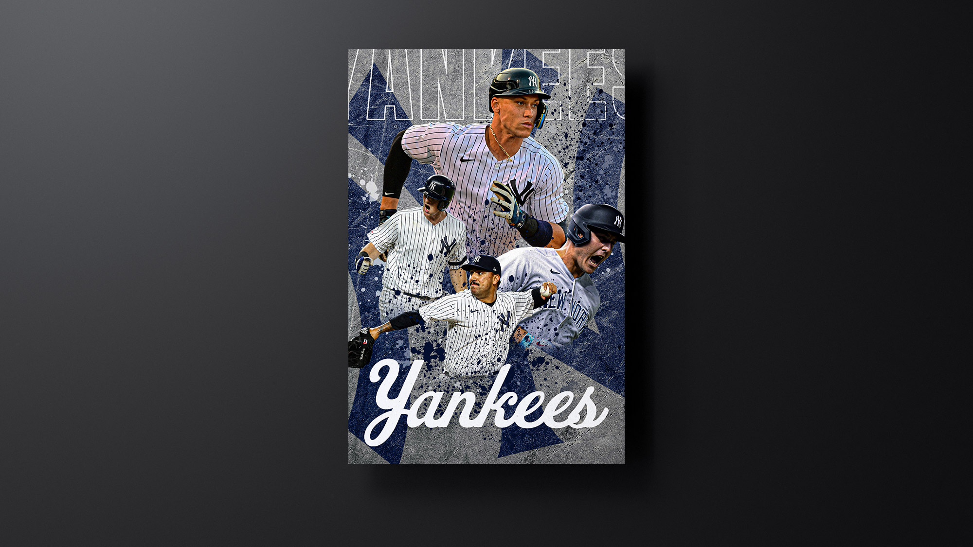
For this project, I wanted to utilize a mix of modern and classic styles. The classic font at the bottom perfectly matches the rich history and long standing of the Yankees as an organization. The title near the top of the graphic acts as a more modern style with the transparent text only visible through the outlined stroke around the letters. I wanted the poster to have details of texture and depth so I added the concrete background which I feel gives a feeling of toughness and grit that is often thought of when people think of New York. Texture is further demonstrated in this piece with the splatter effect over the players as well as the utilization of the player images texture added through the neutral filter settings in Photoshop.

Raiders Player Cards

Graphic Design

Raiders Player Cards
2022
Learn More
This was a passion project for me. I wanted to attempt to capture the style of the Raiders into simple, to the point, graphics that showcased a player’s stats after the game. Upon looking at the graphic, a viewer can easily see the player’s stat line without having to read through a lot of content. The graphics use the Raiders color scheme and modern tone and work well in a series of graphics. I used InDesign for the building process and Photoshop for any edits done to the photos of the players.
Pasta Amore Menu Design

Graphic Design

Pasta Amore Menu Design
2022
Learn More
For the Pasta Amore menu project, I wanted to combine modern design elements with traditional Italian styling. To do this, I used a San Serif font for the content and a two column layout. I used colors from the logo but I didn’t overuse them so as to not make the menu look too unprofessional. I added wine glasses and wine bottles to the menu to capture the Italian restaurant theme and tone.
Stream Offline Livestream Graphic Mockup

Graphic Design

Stream Offline Livestream Graphic
2021
Learn More
This project was another fun passion project for me. I enjoy spending my free time watching streamers play video games and I always have my eye on the branding behind their channels. I wanted to see if I could come up with my own branding assets for a hypothetical streaming channel and so I started with the logo. I figured out a color palette that suited the brand and went to work on creating a brand style guide. I wanted fonts that fit the video game theme and that I could use as body text without it becoming unlegible. The combination of the colors worked well as the green acts as a great highlight color. This design is meant to be simple and too the point that way viewers aren’t sitting there reading too much information.
Zillah Dev Branding Graphics

Graphic Design

Zillah Dev Branding Graphics
2021
Learn More
This project was a fun experimental project. I wanted to try something that allowed me to utilize tools in Photoshop that I didn’t ever spend a lot of time on. For the first artboard, I wanted to focus on depth and texture. I played around with shading and utilizing the “noise” feature in photoshop to make the shapes really pop. I also added the palm leaves as a way to showcase the pattern tool in photoshop.

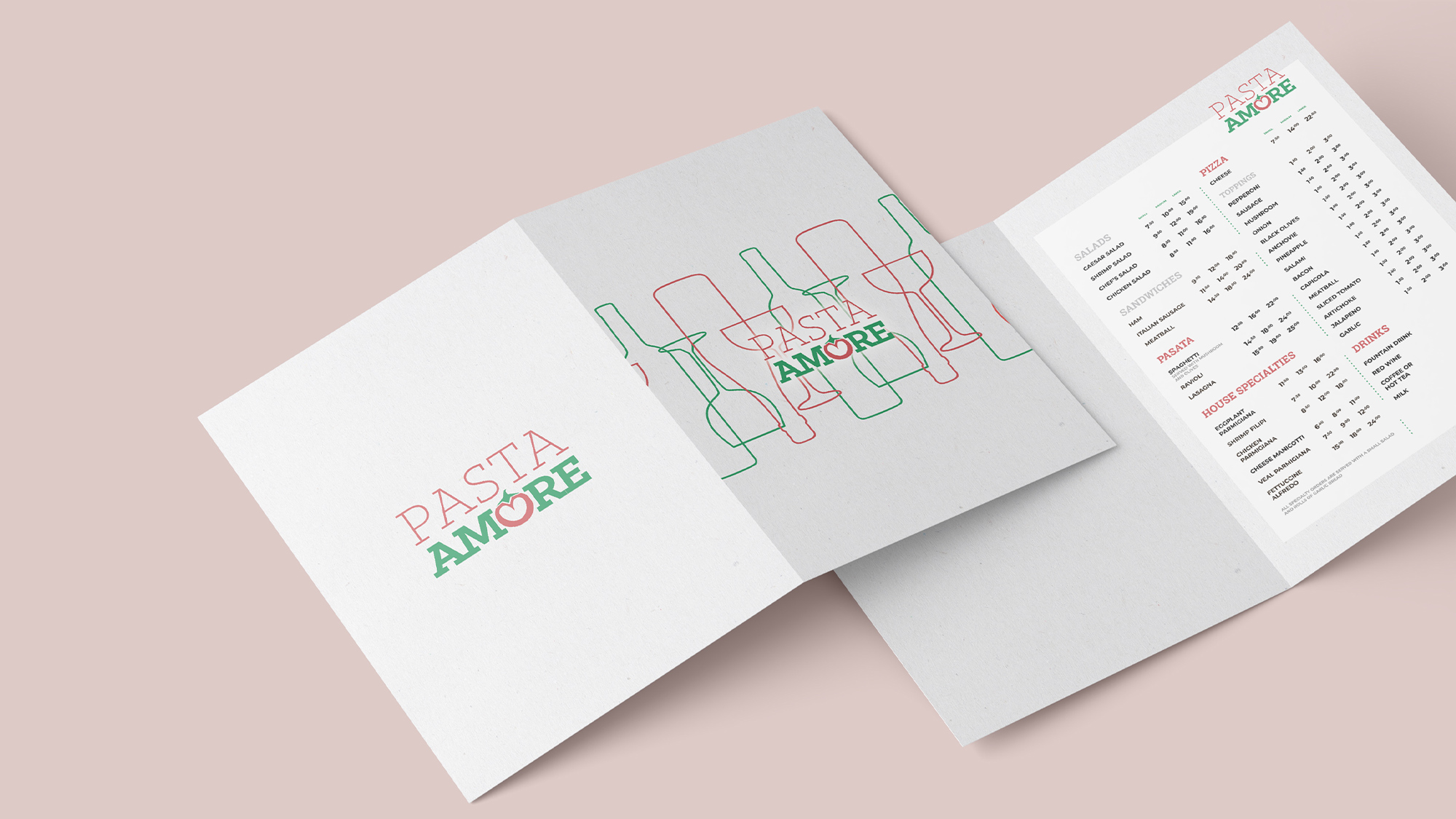
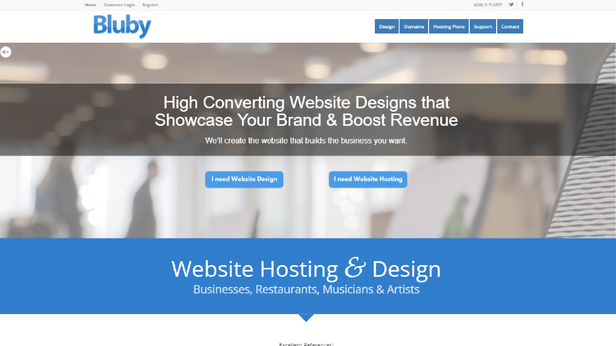
For the second artboard, I wanted to create something more “traditional business”. There wasn’t going to be a lot of texture and I wanted to just create something that you might see for a small local business. I played around with changing the color of a single word in the title to break the text up but to also act as a keyword of sorts. The design was clean and simplistic and I think it fits well in the traditional techy business category.

Analog Magazine Redesign
Digital Publication
Analog Magazine Redesign
2021
Learn More
Going into this project, I knew I wanted to create a science fiction style magazine. Doing my research, I was finding a lot of science fiction magazines lacked the advanced tech styling throughout the magazine. I took it upon myself to use fonts and shapes that felt like something you would see in an advanced computer system in a science fiction movie. I came up with the hexagon shapes to be used throughout as I felt like they gave off a technological tone throughout. I also felt that adding corner styling touches around images gave the magazine more depth. The combinations of the dark blues and oranges really helped bring the magazine to life. It was both visually appealing and legible while also keeping the main goal in mind (making a science fiction feeling magazine).
Amethyst Bay Resort & Spa Flyer
Graphic Design
Amethyst Bay Resort & Spa Flyer
2020
Learn More
For this project, I created a flyer for Amethyst Bay Resort and Spa. This project was meant to focus on a sale or deal and the use of typography hierarchy based on color and size of text. I utilized Adobe’s InDesign to create the banner based on dimensions of a traditional piece of paper. The design is modern and simple to follow with legible text, clear to see visual hierarchy, and just enough content to grab the viewer’s attention and give information without being too overwhelming with text.
Edgar Allen Poe Word Cloud
Graphic Design
Edgar Allen Poe Word Cloud
2020
Learn More
This project showcases a word cloud design which is a picture that is created by only using words. For this, I used words from Edgar Allen Poe’s poem “The Raven” to create a portrait of the author. I utilized Photoshop for this project and used layer masks to form the shape of Poe’s portrait. I used typography hierarchy on words I felt viewers would mostly associate with the poem. The title “Raven” is the largest word as it is the subject of the poem.
Website Design

Web Design

Bluby Web Services
2019
Learn More
This project involved the creation of a website and the implementation of a 3rd party program service. The client requested to have multiple call to action buttons that linked viewers to the program services. Considering that this was the biggest point of interest given by the client, I designed the entire website with that in mind. I first wanted to make sure the user could clearly see the call to actions and would understand what they lead to. I added a banner on top of the call to action to provide further information to the viewer and to act as a quick introduction to the website. Since the color blue is most commonly related to professionalism and responsibility, I felt it was the perfect color to use for this company. I also explored the idea of using green as the main color but it felt a little too much for the eyes at times. Blue fit perfectly with the brand and I made it a huge part of the company name as well.